Pure-trition
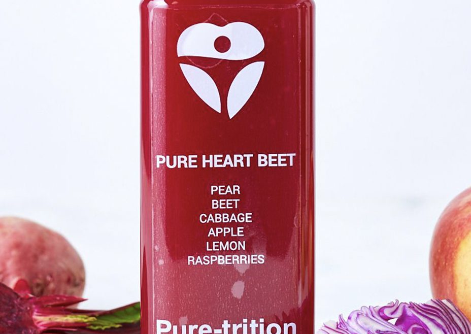
Pure-trition is a natural juice bar that hired us to work on their branding and packaging. This includes logo design, business cards and various packaging for their products.
Pure-trition is a natural juice bar that hired us to work on their branding and packaging. This includes logo design, business cards and various packaging for their products.
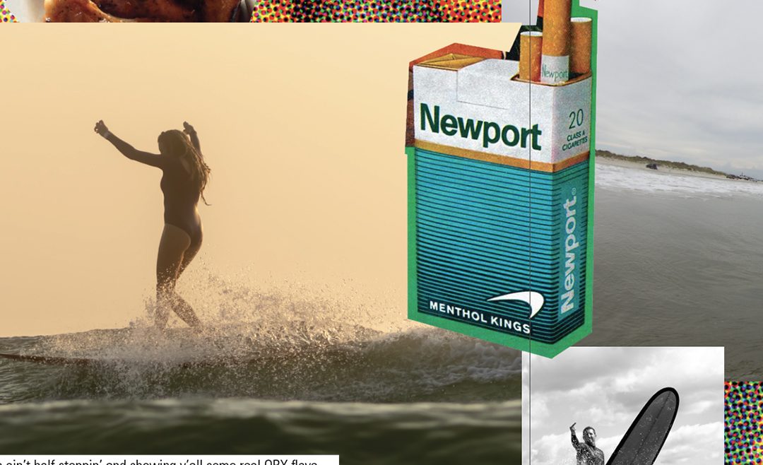
Bodega Boarder Crew is a multifaceted brand I created as a response to the “jockification” of the surf world. The concept was to combine two seemingly different worlds (surf culture and urban culture) and combine them to show the similarities they share. Through this brand I have developed apparel, print publishing, events, podcasts and videos. I have also been able …
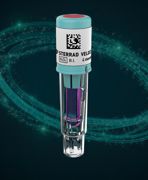
We were brought in by ASP to help them with the product launch for Aeroflex and Velocity. Our main tasks were to create promotional and marketing materials related to the two products. This includes sales aids, internal documentation, web based landing pages and general print pieces. We continue to work with them in expanding on their initial product launch.

Sun Tasty was going to be introducing a new line of dried fruit snacks to the US market and tasked us with developing their trade show booth identity. We worked closely with their marketing department to come up with a design aesthetic that not only portrayed all the key points of the products but showed the relationships their products encourage.

Pack N Smash is a novelty gift company with a unique gifting experience. The brought us in to develop their brand and help with all marketing and design executables. This includes packaging, investor presentations, marketing strategies and product development.

Annie Free is an illustrator with a huge Instagram following. She approached us with a request to help her to develop her branding and product line. First we developed her logo and identity off of her illustrations as well as a font to use on all her pieces. Next we developed branded packaging pieces for her line. This was followed …
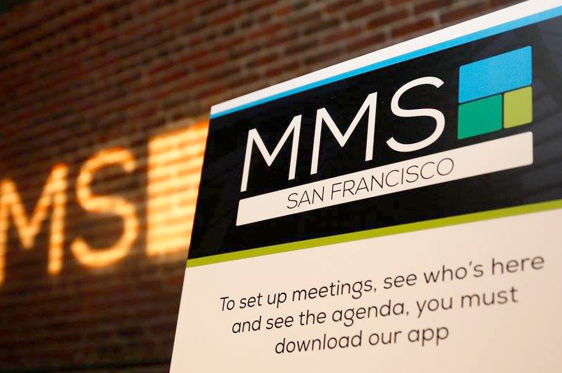
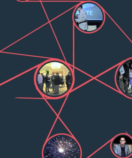
Modern Marketing Summit was a digital marketing conference that had events in cities such as London, Barcelona, New York City, Los Angeles, Chicago, San Francisco and Cannes. As the head creative director for three and a half years I was responsible with redesigning the brand and executing that brand DNA across multiple channels. Those channels included web, mobile, video, stage, …
While our team was part of Comexposium USA we were tasked with rebranding the iMedia brand and making sure it was carried through all channels. This included site design, event signage, video pieces and much more. Past that we were tasked with getting the brand to be implemented globally. This entailed creating a concrete style guide with feedback from every …
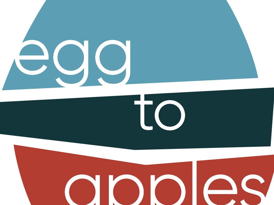
Egg To Apples is a digital marketing firm that specializes in developing solutions in conjunction with Google AdWords accounts for clients of all different backgrounds. They approached us with creating a new visual identity for their company that reflected their company ethos. Through that we developed a new logo scheme, style guide, type language and web presence for them. Their …

Raydoor Inc had approached us in 2003 to re-brand their sliding door and wall company. The main objective was to give them a strong identity that worked with the visual language their clients, interior designers and architects, were familiar with on a day to day basis. We started with their logo and identity package as the main project. From there …